Hi, I'm Jeff 👋
"Great design simplifies a very complicated world" — Platon
I've spent nearly a decade in tech, evolving from project management to product ownership, and ultimately finding my calling in UI/UX design. My journey through Salesforce administration and product ownership taught me a crucial lesson: to truly advocate for users, I needed to shape the experience, not just manage requirements.
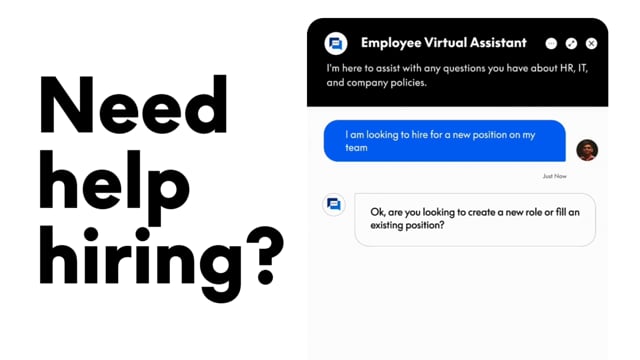
I taught myself to code to bridge the gap between design vision and technical reality—understanding constraints makes me a better designer. Now, I craft experiences that simplify complexity and champion the user at every touchpoint.